On November 10th, I sent out a call to artists to submit their thoughts about color. And for doing so, your name will be put in a drawing on Feb. 1st... (see Nov. 10th post).
Anyhow,
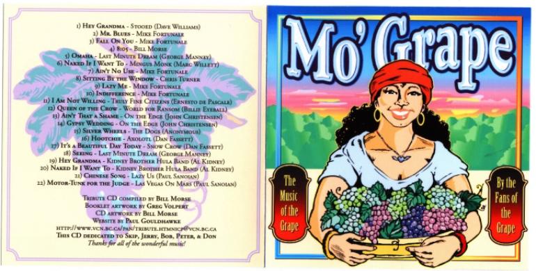
Graphic Artist Greg Volpert took the time so share some of his thoughts about color and it's various roles in his work.
 Beaders and jewelry artists, draw inspiration from Greg's color palette. And please do share your new creations with us. I promise to do the same.
Okay folks, here's our mini interview-
* Do you believe the region of the country you live in, or city vs. country, influences your chosen color palette?
I know that the earth tones, trees, water, fields, and vast skyscapes of my beloved Kansas countryside influence my choices. I spent a lot of my childhood exploring the woods and lying on my belly, peering into creeks at crawdads and pickerel frogs. Frogs, and goats, have the most beautiful eyes, like gold-flecked jewels.
An autumn walk through a field that looks uniformly tan from the highway uncovers a whole unexpected world of colors: reds, purples, greens and golds, blues and grays and whites. And totally unexpected juxtapositions, and they work. I'm beginning to think there's no such thing as "a color that doesn't appear in nature".
I live in a city where a spectacular rainbow, towering miles into the sky and spanning the eastern horizon, made the front page of the newspaper this summer. Crowds of shoppers were pouring out of the stores to see it and take pictures, calling their friends on cell phones, "HURRY! You've got to see this!" In the east, an electrifying triple rainbow, neon-vivid against a slate-gray sky; turn 360 degrees; and in the west, a breathtaking sunset. No skyscrapers to obscure the view.
* Does your color palette change because of current color in fashion or media?
No, In SPITE of it! Retro is the new black!
 (...Sometimes I'll ask myself, "What would Thomas Kinkade do?" Because whatever Thomas Kinkade does, it's precisely what I do NOT want to do. Thomas Kinkade is the Antichrist!)
* Are you challenged to find a color palette that defines you as an artist?
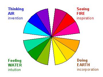
Hey. I used to be. But I got wise. All I had to do was get me a Grumbacher color wheel. "Okay, I like golds and oranges. Why do blues and purples work so well with those? …Aha."
 * Are you challenged to constantly redefine your work with color?
Once in a while I'll revisit an old project and go, dear god, what was I thinking? ...OR, I'll pat myself on the back and admit that I was a lot more sophisticated back then than I gave myself credit for. So ... sometimes yes, sometimes no. The enclosed piece (email me to view this image) is an example of an older project revisited and major coloristic changes made. The original was fine, but it was time to move into a new area. I can't wait to see what I do with it four or five years from now.
* Are the colors you choose to work with influenced by the type of media you work in?
Oh, definitely, definitely. If I'm working in colored pencil I tend to use subtler colors and gradations; but switch to paint and I become the Iron Chef. And having millions of colors of digital paint at my disposal gives me the whole symphony orchestra to play with, and the amphitheatre, and the recording studio. In fact sometimes I have to force myself to limit my palette, there's just too many choices.
 * How do you choose the colors you work with?
Frequently I'm trying to achieve a trompe-l'oeil effect so obviously, the appearance of the object dictates the colors. If there's a specific mood or feel I need to convey, I'll make color choices accordingly; taking liberties with values and contrasts and whatnot.
* Is your color palette chosen based on personal taste, or your perception of your own self?
Well you see, that's one of the wonderful things about being an artist! You can impose your own tastes (or lack thereof) on the world. I'd say most of the time it's based on my own tastes, but wouldn't those be an outgrowth of one's self-perception? "I'm a witty sophisticate, hence my color choices shall reflect that." "I'm a worthless wretch, the world is a cold gray tomb, and my colors reflect that." "I'm an outrageous maverick who prizes shock value, and that extends to my use of color."
 * Do outside forces like music, politics, seasons, job environment, friendships etc. influence your color choices?
You bet! All of the above and more. But you know what? Many times it's like a self-hypnosis thing, for instance: okay, I'm going through the most horrible time imaginable, I need to cheer myself up, I will consciously use happy, sunny colors even though I feel like something you scrape off your shoe. OR, I'm in a good state emotionally and spiritually, I can afford to explore the DARK SIDE.
 Music is inseparable from my creative process. I've gotta have music be it vintage jazz or Jefferson Airplane, whether I'm drawing or cooking. Music influences my colors, and it influences my spices!
* Is your choice of color completely random? A matter of whatever is available to work with at the time a project is begun?
Since most of my work these days is onscreen it's not a question of what's available. It's ALL available.
And Hobby Lobby is only three blocks from my home, so if I need a different acrylic paint or a Prismacolor, it's just a matter of making sure I look presentable and marching down the hill. Except on Sundays of course.
I may do some experimenting while I'm creating a piece but I usually have a good idea where I'm going. (Especially if I'm working under a deadline.) It's in those final, piddling-around, tweaking stages (where I'll move a line of type half a point[*], study it, and move it back) where I may make some arbitrary choices, just to see what effect they'll have. After all, there's always Command Z.
[*] I'm not kidding about that half-a-point business. That's One 144th of an inch! Like anybody's gonna notice?
* Are your color choices formulaic, or based on spiritual meaning of color?
Ummm, maybe a little of both? Maybe there's a spiritual formula, a Golden Section for Color. A Divine Color Scheme: A Red scene is Mean, while Green is Serene? And Yellow is Mellow, but...what the heck rhymes with Orange?
By way of winding up, I grabbed this paragraph out of my earlier e-mail to you, Dawn:
Although I don't really consider that there's a typical Greg Volpert Color Scheme, I definitely have a signature style; and occasionally when I'm trying to jump-start the creativity I find myself using familiar colors, and combinations of color, that have worked for me before - kind of my Color Comfort Zone, I guess.
I want to be more like the Mexicans when it comes to color. You know, BOLD. SURPRISING. FEARLESS.
  Greg Volpert does freelance work from his home in Lawrence, Kansas.
--You may visit him at either website below.
PORTFOLIOS:
http://www.myspace.com/smileymurdock
http://www.creativehub.com/users/Greg-Volpert
 * Are you challenged to constantly redefine your work with color?
Once in a while I'll revisit an old project and go, dear god, what was I thinking? ...OR, I'll pat myself on the back and admit that I was a lot more sophisticated back then than I gave myself credit for. So ... sometimes yes, sometimes no. The enclosed piece (email me to view this image) is an example of an older project revisited and major coloristic changes made. The original was fine, but it was time to move into a new area. I can't wait to see what I do with it four or five years from now.
* Are the colors you choose to work with influenced by the type of media you work in?
Oh, definitely, definitely. If I'm working in colored pencil I tend to use subtler colors and gradations; but switch to paint and I become the Iron Chef. And having millions of colors of digital paint at my disposal gives me the whole symphony orchestra to play with, and the amphitheatre, and the recording studio. In fact sometimes I have to force myself to limit my palette, there's just too many choices.
 Greg Volpert does freelance work from his home in Lawrence, Kansas.
--You may visit him at either website below.
PORTFOLIOS:
http://www.myspace.com/
Glad to know it's Thomas Kinkade that is the Antichrist. Whew! Now I can stop wondering...
ReplyDelete